Adesola Sobambo

Case Studies

A look at recent analytics work — the business question, what I found, and what I delivered.

FEATURED PROJECT
Power BIPower QueryWord

Superstore Sales Performance Dashboard

  • Project type: AnalystLab Africa Internship Project
  • Role: Data Analytics Intern
  • Data source: Public dataset (Superstore, Kaggle), used for internship training
  • Scope: Dashboard development (Power BI), sales/profit analysis

The problem

Management had no single place to see sales performance, profitability, customer segments, and regional results — decisions were being made on partial information.

What I did

Built a 3-page interactive Power BI dashboard from a 9,994-row, 4-year transaction dataset: KPI cards, regional and category breakdowns, top-product analysis, and a fully cross-filterable executive summary.
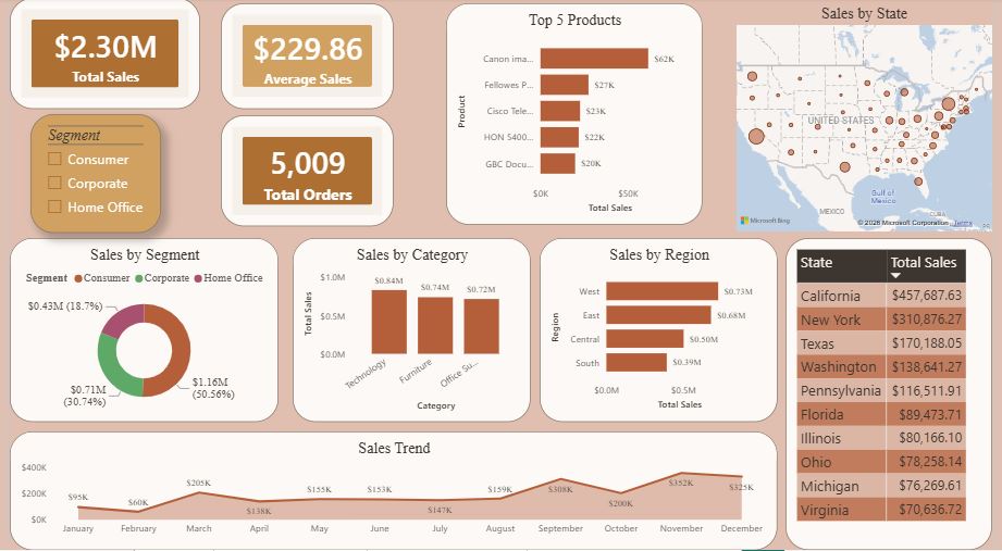
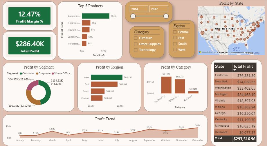
Superstore Power BI sales page: KPI cards for $2.30M total sales, $229.86 average sales and 5,009 total orders, plus top five products, sales by state map, sales by segment, category and region, and a monthly sales trend line.Superstore Power BI profit page: 12.47% profit margin and $286.40K total profit cards, top five products by profit, year, category and region slicers, profit by state map, profit by segment, region and category charts, and a monthly profit trend line.

What I found

  • The West Region leads in both sales ($0.73M) and profit ($0.11M).
  • Technology is the most profitable category; Furniture consistently underperforms.
  • Profit is concentrated in a small number of top products.
  • Sales climb sharply every Q4, a clear seasonal pattern.

Deliverables

A Business Intelligence Overview Report and a one-page Executive Summary. A static preview is available; the full interactive dashboard is in the .pbix file, plus 6 recommendations covering regional strategy, product mix, and discount discipline.
ExcelPower QueryWordPowerPoint

Customer Churn Analysis

  • Project type: AnalystLab Africa Internship Project
  • Role: Data Analytics Intern
  • Data source: Public dataset (Telco Customer Churn, Kaggle), used for internship training
  • Scope: Data cleaning, churn analysis, insight reporting

The problem

Internship analysis of a telecom dataset revealed a 26.5% customer churn rate, with no clear indication at the outset of which features or behaviors were responsible.

What I did

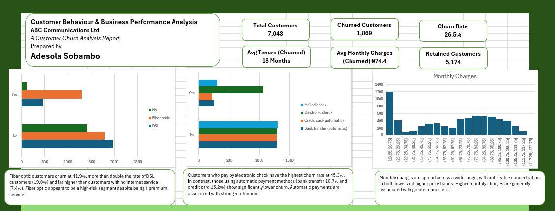
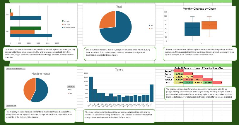
Cleaned and inspected a 7,000+ row customer dataset, then built out a full churn analysis — contract type, service type, payment method, tenure, and billing all cross-examined against churn rate.

Customer churn analysis dashboard page one: KPI cards showing 7,043 total customers, 1,869 churned, a 26.5% churn rate, 18-month average churn tenure and 5,174 retained customers, with bar charts on internet service type, payment method and a monthly charges distribution.Customer churn analysis dashboard page two: contract-type churn bars, an overall churn pie chart, a monthly charges by churn box plot, a month-to-month contract share pie, a tenure distribution histogram and a correlation heatmap.

What I found

  • Month-to-month contracts churn at 42.7%, vs. 2.8% for two-year contracts.
  • Fiber optic customers churn at 41.9% — more than double the DSL rate.
  • Electronic check payers have the highest churn of any payment method (45.3%).
  • Nearly half of all churn happens in a customer's first 12 months.

Deliverables

A Business Understanding & Data Inspection report, a full Excel analysis workbook, and a stakeholder-ready presentation — 5 insights, 3 risks, 3 opportunities, and 5 concrete recommendations tied directly to revenue protection. Because this was internship training work on a public dataset, no live organisation implemented these recommendations — operational feasibility and business impact remain unmeasured.